Lesson – Color Theory Basics
Overview
This lesson is part of the course Fundamentals of Art. Together with Anatomy, Form, Value, Perspective, and composition, Color contributes to the overall visual impact of Art.
Color and Color Theory form the foundation of art and design. Understanding color and how it works can help students with simple things such as choosing a color palette for an outfit, choosing the right color for their bedroom to what color to use when designing a logo for a client or personal use.
In this lesson, the basics of color theory and its key concepts will be discussed. A simple assessment will be used to make sure that key concepts and terminologies are understood and applied. Design tools and references will also be provided for students to be able to create color schemes that they can use as a tool to create an effective design or artwork.
Lesson Objectives
• Students will be able to define and differentiate commonly used terminologies such as hue, saturation, color variety, and value.
• Identify color groups in the color wheel
• The student will understand the relationship between each color group and effectively use it as part of their design tools.
• The student will be able to create color schemes through the use of different websites and software.
Read/Watch
In this video, you will learn about the color wheel and color harmony concepts, which are crucial for selecting colors that are visually pleasing, coherent, and impactful, resulting in an effective design. Additionally, the video covers common color mistakes and provides instructions on how to choose the right color and find inspiration.
Content
Let’s recap what we have watched and further look at how color is an important tool in Art and Design.
What is Color?
Our eyes perceive color as a result of light bouncing off objects and entering our eyes, which then interpret the combinations of light to create color.
What is Color Theory
Color theory is the study of the principles of color, both in science and art. It explores color in relation to other hues and its measurements. Color theory sets the foundation for artists to work with colors. However, it’s important to note that these principles are not absolute rules. They should be used as guidelines and not restrict your creative process. The logical structure of color theory can be divided into three categories – The color wheel, color harmony, and colors in context.
Why is Color Theory important?
Color schemes play a vital role in branding, promotion, and sales. The right color can make your brand stand out and attract your target audience. Understanding color associations and avoiding poor color combinations can help you create effective ads, make better branding decisions, and boost your sales. So, use color theory to your advantage and create a brand that resonates with your audience.
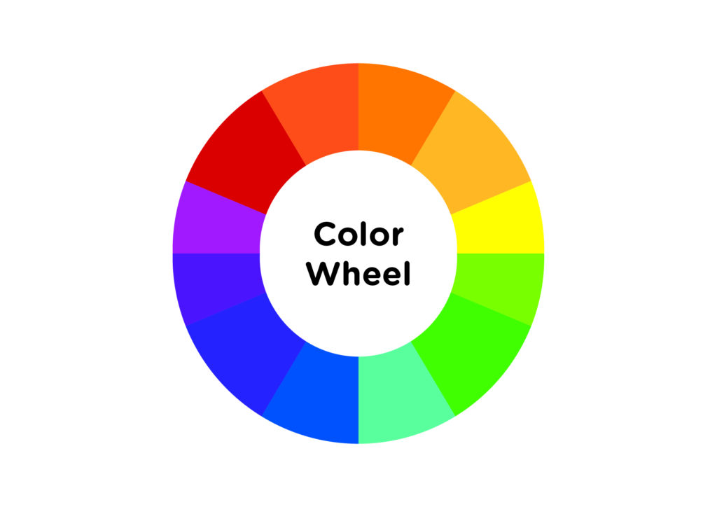
1 – The Color Wheel
The color wheel is a vital tool for selecting color schemes. It displays primary, secondary, and tertiary colors alongside their associated hues, tints, tones, and shades. Mixing white, black, and gray with the original colors creates brighter, lighter, softer, and darker colors. This allows you to experiment and create unique color schemes for your projects.
Definitions and Terms
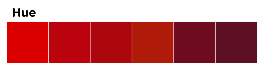
Hue
The term ‘hue’ refers to the quality of color that distinguishes it from other colors. It is essentially what color you are specifying. Hue also refers to the dominant wavelength of color out of the 12 basic colors. For instance, the hue of crimson is red.
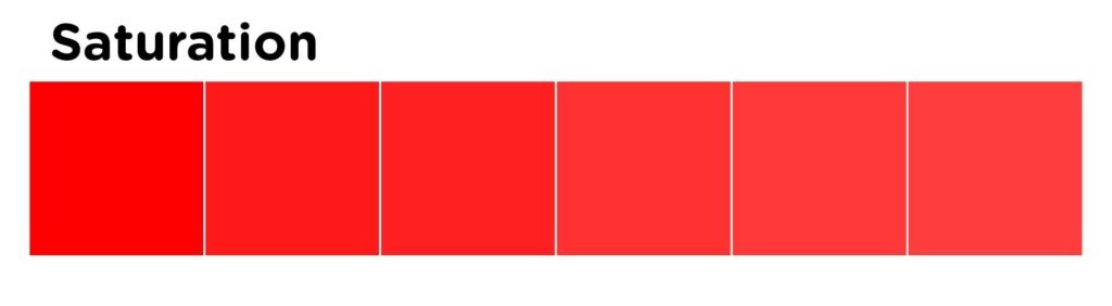
Saturation
Saturation refers to the intensity of color, or how pure a color is. A high saturation indicates a very bright color, while desaturation refers to a washed out or grayed out color.
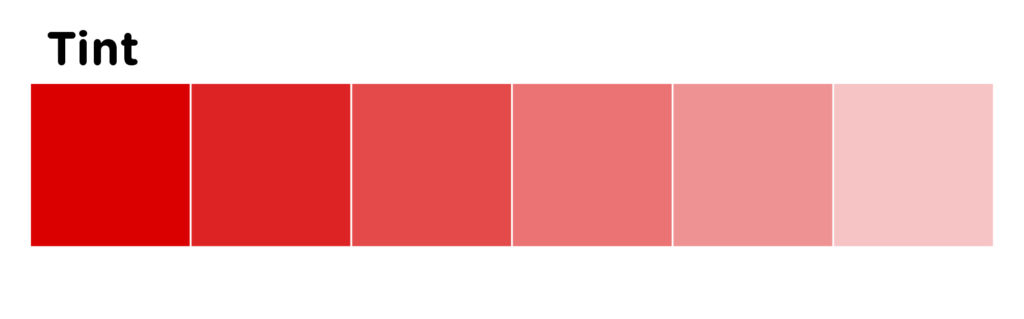
Varieties of Color
Tints are colors created by adding white to a hue.
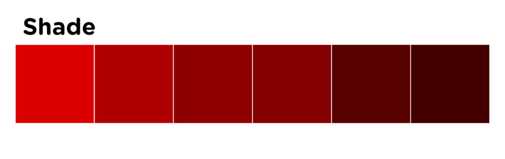
Shades are colors created by adding black to a hue.
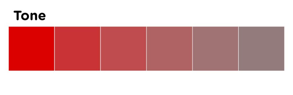
Tones are colors created by adding grey to a hue.
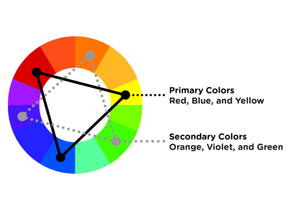
Primary Colors
Red, blue, and yellow are considered “primary” colors because they cannot be created by combining other colors. They are the most fundamental and basic colors. Because they are the foundation of every color, they can be mixed to create a vast range of colors.
Secondary Colors
Secondary colors are created by mixing two primary colors and are located between them.
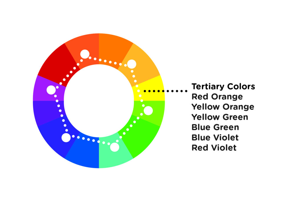
Tertiary Colors
These colors are a blend of two secondary colors and are positioned between them in the color wheel.
2. Colors in Context
Color Harmony
Understanding color theory can be achieved by first comprehending the significance of color placement on the color wheel and how it affects color harmony. Warm colors, such as red, orange, and yellow, are associated with heat, fire, the sun, and blood. They are energizing in nature and create a feeling of excitement, movement, or passion. On the other hand, cool colors, such as blue, green, and purple, are associated with cold, night, stillness, despair, and sadness. They evoke feelings of peace or serenity and can be calming. It is important to note that the use of warm and cool colors can greatly impact your visual product.
Color Schemes
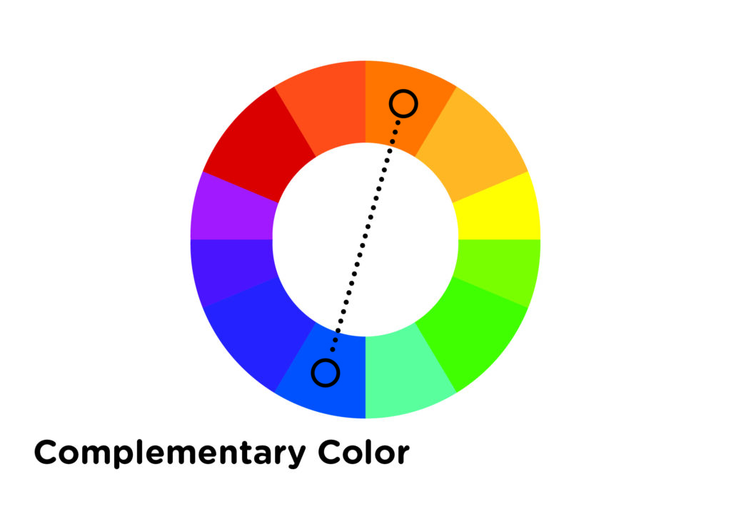
1. Complementary Colors
Opposite colors on the color wheel are known as complementary colors. Because they are far away from each other, they create a dissonant relationship. When placed side-by-side, complementary colors can produce a lot of contrast, but we need to be cautious because it can be overwhelming to the viewer if used excessively. Additionally, complementary colors can easily compete with each other and create visual chaos. Therefore, it’s best to use one color as a dominant shade and the other as an accent color.
2. Analogous Colors
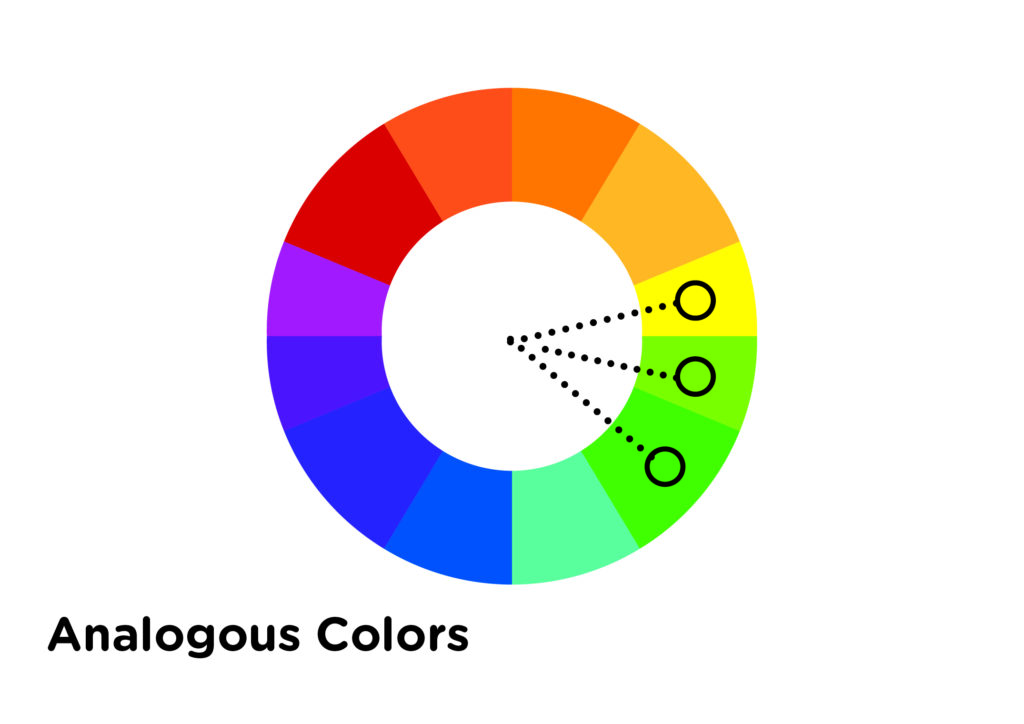
On the color wheel, a combination of two to four colors that sit adjacent to each other is known as an analogous color scheme. These colors have a harmonious relationship due to their close proximity. Even though they are considered to be a calm and relaxed combination, it is still recommended to choose one color as the dominant and use the others as accents.
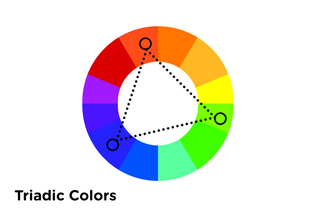
3. Triadic Color scheme
To follow the triadic color scheme, one needs to pick three colors that are equally spaced on the color wheel. Despite their even distance, the colors may not always create a harmonious effect if not used properly. Therefore, it is still recommended to use one color as the dominant and the other two colors as accents. This will help to create a visually appealing and balanced color scheme.
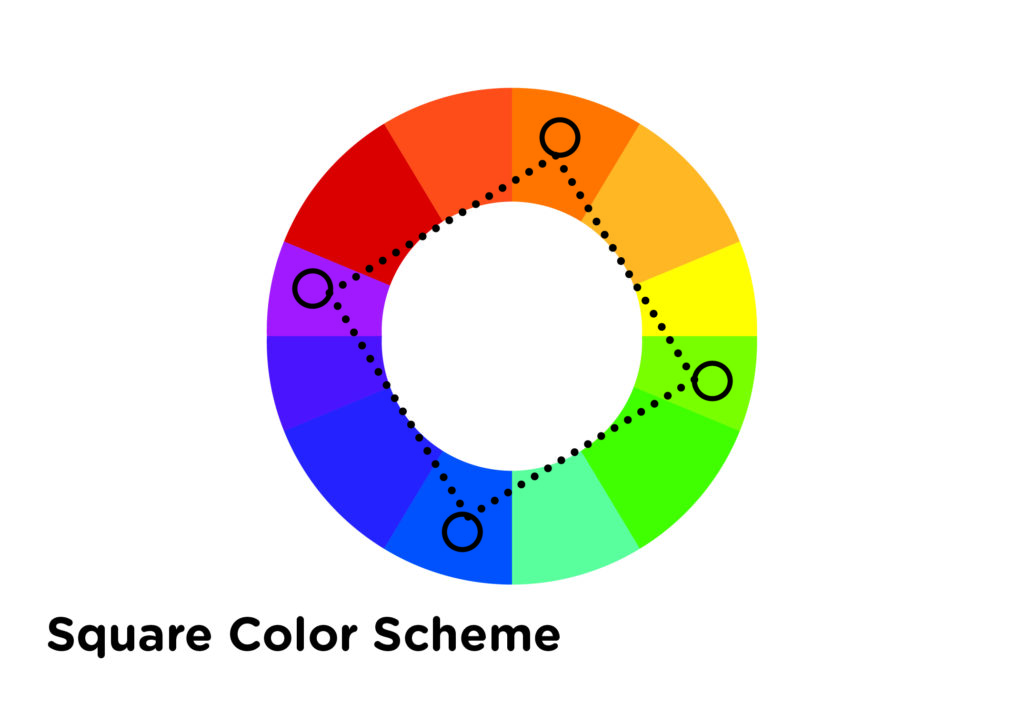
4. Square Color Scheme
For this color scheme, we’ve used four colors that are equally spaced around the color wheel, similar to the previous one. However, it’s important to note that the proximity of the colors can create patterns, but the use of more than one can cause dissonance. Therefore, we recommend you handle the colors with care and stick to the one dominant color rule.
5. Tetradic (rectangle) Scheme
When it comes to utilizing colors in a painting, there are various methods that a painter can follow. One such method is the use of four hues, just like a square, where the colors are arranged in a manner that creates two complementary colors. While this method may be tricky to implement, it offers a lot of variety to the painter. However, it is recommended to follow the one dominant color rule, which guarantees the best results. Additionally, when using the tetradic color scheme, one should always consider the color temperature.

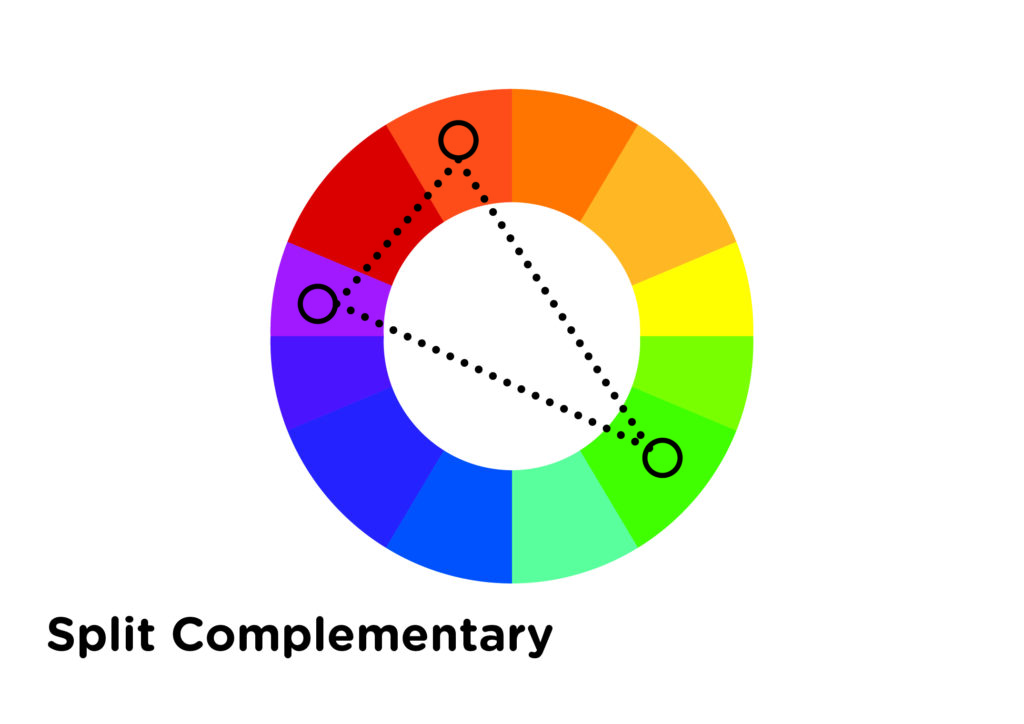
6. Split Complementary Colors
When using a three-color scheme, it is recommended to have one base color and two additional colors that are adjacent to the base’s complementary color. However, it is important to be careful with the proximity of these colors to avoid unwanted dissonance. Therefore, it is recommended to follow the one dominant rule.
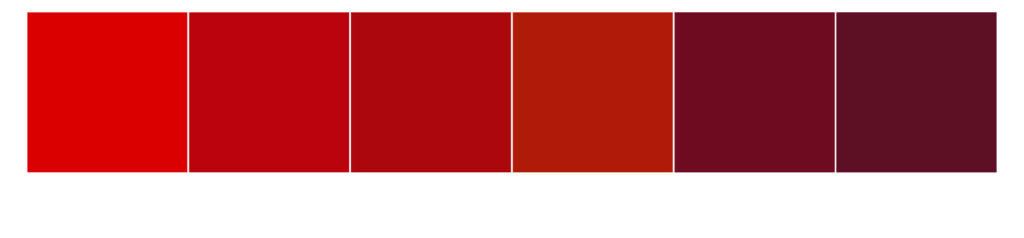
7. The Monochromatic Color Scheme
This scheme is based on one color and its variations, achieved by adjusting saturation and brightness through addition of white, black, or gray.
Color Temperature
Color temperature, in the context of color theory, refers to the warmth or coolness of a color. Warm colors, such as red, yellow, and orange, are generally bold and vivid. They tend to appear closer to the viewer, while cool colors, such as green, blue, purple, white, and gray, are considered calm and soothing in nature. Cool colors tend to recede in space and create a sense of depth. For example, distant mountains might appear a cooler blue or purple, while objects in the foreground might have warmer notes. Artists can use warm and cool colors to create realistic and exciting works by understanding the temperature of a color in the subject and using it accordingly in their paintings.
Warm Colors
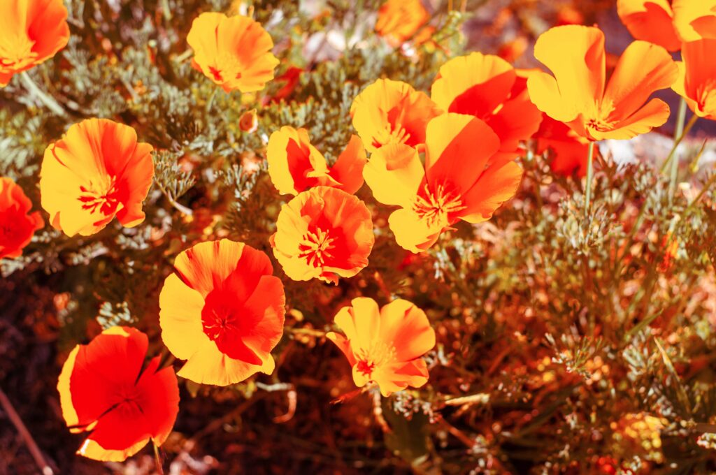
Warm colors, in the realm of art, are those hues that impart a sense of warmth, such as red, orange, and yellow. These colors are often associated with fire, the sun, and heat. They can create an atmosphere of intimacy and excitement and make an area feel closer.
Colors: Red, orange, red orange, yellow, yellow-green, and red-violet.
Mood: Excitement, liveliness, joy, anger, love or passion.
Association: Summer, fall, fire, anger, and blood.
Property: They have a tendency to be more dynamic and colorful, thus attracting the attention of the viewer.
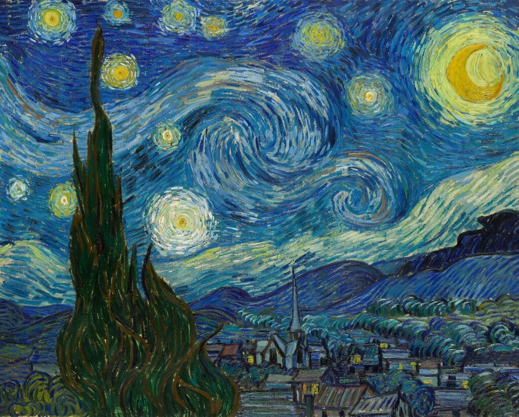
Cool Colors

In art, cold colors refer to hues that create a sense of coolness. These colors include blue, green, and pale purple. They are often associated with water, grass, and sky. The use of these colors can create a sense of distance and make an area appear further away. They are also capable of making a space feel more serene and calming, although they might also be associated with sadness and depression.
Colours: Blue, green, blue-green, violet, and blue-violet.
Mood: calm, serenity, sadness, stillness, death, and shadow, .
Association: Water, Ice, Sky, and Winter
Property: They create a calming effect on the viewer due to their receding and relaxing nature.
How to use warm and cool colors in art and design
Now that we know all about warm and cool colors let’s look at how to use them in our artwork.
- Use warm colors to attract attention – The most important part of a piece is the focal point, where you want the viewer’s eye to be drawn. Warm colors can be used to attract attention to this area.
- Use cool colors to create a sense of space – If you want to create the illusion of depth or distance, use cool colors as they tend to recede, while warm colors come forward.
- Use warm and cool colors to create contrast – This will add visual interest. Warm colors create contrast in cool palettes.
- Be careful to consider the relative color temperature. – The colors around a particular color can affect the way it looks. So, when choosing a warm tone, you don’t necessarily have to stick to reds, oranges, and yellows. Even a blue with a slight tint of violet can be the warmest color in your painting, while still having all the warm tone properties.
Application
Reflection
Find one well-known Painting or Take a look at the brand logos of well-known brands. Try to identify the colors used by the designer or artist.
Here are a few guiding questions to help you reflect on your observations:
– What colors did the artist or designer use?
– Can you identify the color scheme used by the designer or artist?
– Based on the lesson about color psychology, why do you think they used that particular color combination?
– What emotions or reactions do you think the artist or designer is trying to evoke?
To Do this week – Scaffolding
- Watch This youtube video to see how canva can be a tool to help you create color schemes:
2. Read this learn about Color Psychology
Reflections
How have you found the balance of passive and active learning in this course for your learning? How does it compare to your experience in other courses?
I found that this course struck the perfect balance between passive and active learning approaches. All of the readings were relevant, and thought-provoking and provided enough support for me to complete the activities required to engage in the active learning part of the course. The activities assigned varied per module, giving me a plethora of tools and options to design lessons and activities. To be honest, I found the course a bit overwhelming at first, given the amount of work required compared to my other subjects, which only require a written and creative output. However, I know that this course will be extremely useful for my capstone project next term, which is a Playbook for Art Educators. This project will provide practical ways to include design in Art Education via a website. Thanks to this course, I now have an arsenal of tools that will enable me to build this website with ease.
What was your experience of trying out H5P? Which of the activities do you think you would make most use of in your teaching context and what would you use them to do? Which ones do you think require the most resources to create?
I had a great experience using H5P to create my interactive learning activity. It’s an enjoyable and practical tool for students to reinforce their learning. As for Design training, I believe that the following activities would be the most beneficial:
Image Choice – This can be used for a lesson about selecting appropriate images for Display ads and other design output.
Find multiple Hotspots – I envision this as a way to train designers to identify which design element works and which does not work for a design material. This can also be used to check grammatical errors or spotting errors based on the design brief.
Image pairing – This learning activity will be best in selecting colours, design elements as well and images. The designer or student can be asked to select appropriate colours that are applicable for certain businesses like restaurants, real estate and medical.
Can you describe (step by step) an example of scaffolding in a learning experience that you’ve designed or experienced?
Scaffolding in a learning experience is a concept that is new to me. However, as I recall how I have built some of the curricula I have designed before, particularly for graphic designers, I believe I have in essence applied the steps described in the 6 Specific Instructional Scaffolding Strategies:
1. Model – The curriculum I have designed for graphic designers before is divided into 2 phases – we call the first phase, Classroom Training where trainers will demonstrate step by step how to design a display ad, based on a creative brief, using a design software. An activity that will allow students to demonstrate what they have learned through the demonstration will follow this, and that is our second phase, which we have called, Assisted Training, wherein the trainer will assist the student as they complete the task.
2. Use Prior Knowledge – Most of the students that we teach are graduates of design. We rely on the prior knowledge they have acquired when they were in design school. Our design lessons are a review of the design fundamentals they have learned as a student but the application is real-life work scenarios, such as designing a display ad or an animated ad.
3. Talk About It – In our design courses, we provide feedback to students on how they can further improve their layout, colour choices and typography. This can be achieved through discussion by showing before and after versions of a design, with the assigned trainer (one one-on-one) or through group discussion.
4. Share Important Vocabulary – Process training is also important aside from Creative lessons. Relevant terminologies that will be useful for students are provided through process manuals or account specification manuals.
5. Show What You Mean – Demonstration plays a huge part in our courses, You cannot teach Image manipulation without demonstrating how to do it using a design software, in our case, Adobe Photoshop. Demonstrations are always followed by a hands-on activity for knowledge check and retention.
6. Use Technology – We support discussions and demonstrations with hands-on training that uses the actual software that they will use once they start their job. We also make use of video tutorials and learning management systems to support our facilitator-led classes.
References
Why is colour theory important? A guide to powerful graphic design. 2023
Tanner, 2023, Lesson 2 – A Quick Lesson in Color Theory
Cherry, 2022, Color Psychology: Does It Affect How You Feel?
How Colors Impact Moods, Feelings, and Behaviors
Recent Comments