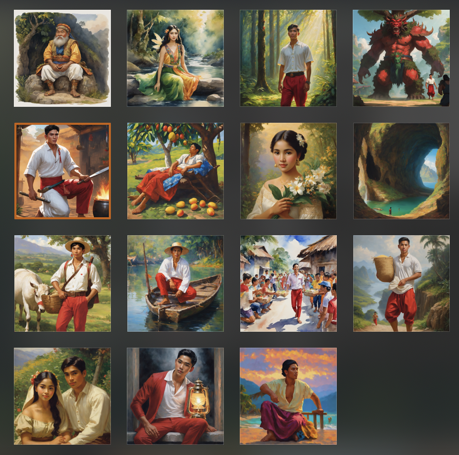
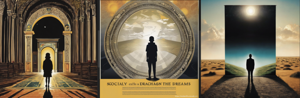
In Module 3, while creating my TWINE story, I used Padlet, a Generative AI-powered tool, for the first time to add images to my story. I wanted my readers to visualize the story which was based on a Philippine Folklore, but I couldn’t pick random images from the internet as they wouldn’t match the look and feel of the story. Drawing images of my own was also not feasible within the given time frame. I was pleasantly surprised by the speed and accuracy of the images generated by Padlet, although there were some minor inaccuracies. However, these inaccuracies did not significantly affect the quality of the images and I was able to achieve the desired artist-inspired look for my images.
One of my prompts for my TWINE Story: Asian-looking man wearing a white shirt and red pants, farmer. Amorsolo-inspired look.
Here are the images I have generated for my TWINE Story:
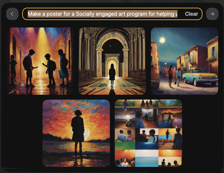
For one of my current courses, Community Art Education, I decided to use stablediffusion to create images and a poster design. I have designed my poster for the Socially Engaged Art activity in collaboration with the my chosen community of interest , however, I am curious to see how a Generative AI-powered visualization tool will interpret my creative brief.
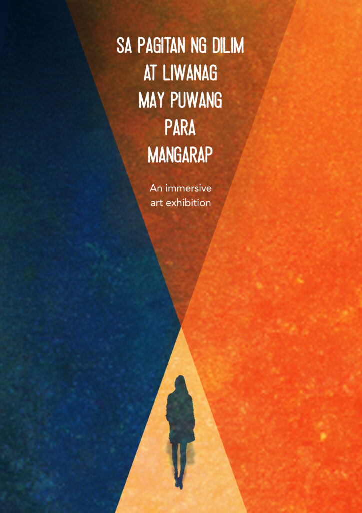
I initially attempted to provide the theme of my project “Between darkness and light, there is a space to dream” (In Filipino version – Sa Pagitan ng Dilim at Liwanag, May puwang para mangarap) to the AI tool, but I received unsatisfactory output. I realized that I may have not given sufficient direction to the tool. Therefore, I decided to experiment with different styles such as SAI-Digital, SAI-Cinematic, and Ad-Advertising. Here are the images I obtained by playing around with these styles.
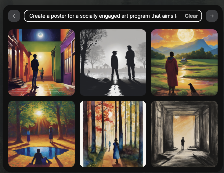
In my second try, I attempted to create a thorough description, as if requesting a graphic designer to produce a poster for me. I didn’t specify any particular color as my main focus was to achieve a visual composition with contrasting light and dark parts that would correspond to the overall theme.
My second prompt is as follows:
“Create a poster for a socially engaged art program that aims to assist underprivileged youth in reaching for their dreams despite the difficulties they may face in life. The poster should have a simple look, featuring a scene with a single person standing in the center. The left part of the scene should be darkened, while the right part should be illuminated as if by a spotlight. There should be no other people depicted in the image.”
And here are the images that I got, playing between the styles, SAI-Digital, SAI-Cinematic and Ad- Advertising.
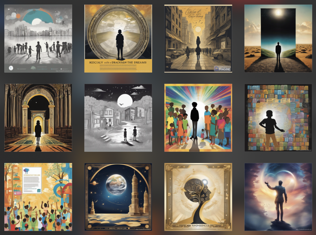
I was able to obtain three acceptable images out of all the ones that were generated. I think they would be suitable with some minor adjustments. As a designer for over 20 years, I have always had a clear idea of what I want to achieve once I have determined a theme. Therefore, I believe that my evaluation of the AI-generated images may be somewhat biased.
The images generated by AI are impressive and have intricate details, but personally, I still prefer the design I created using Adobe Photoshop. I think this highlights the disadvantage of AI-generated images. If you have a clear vision of the look you want to achieve and the story you want to tell, AI generative tools may not fully satisfy your needs. However, they can still be useful in assisting you to further visualize your design or provide inspiration.
The poster I have created for my CAE project:
The article “3 Ways Generative AI Is Changing Media Creation” by Falon Fatemi explains how AI can create new images inspired by certain artists, like an entirely new Rembrandt. That is how I see it comparing the AI-generated images I got for my TWINE Story and The ones I got for my CAE Project, which is something that I am passionate about considering that it is for the community that I am interested in helping. But then again, this is just my initial foray with AI generative tool and perhaps, I need to learn how to write a better prompt for the AI tool to achieve what I want.
Reflections
What might you use AI tools for moving forward? What would you not use them for?
Considering the quick turnaround of this tool, I intend to use it as a tool for students to visualize lessons or get information, provided that they use appropriate referencing. Although I find the output of these AI tools for Advertisements or Theme-based images not completely satisfying, they can be useful for image generation.
What ethical concerns do you have (or not have) about the use of some of these tools?
One of my biggest ethical concerns is related to copyright infringement. Nowadays, with AI-generated images becoming more common, people are using these images and passing them off as their own creations without specifying that they are AI-generated. This is a common occurrence on social media, where individuals post content generated by AI without disclosing its source. There are also instances when these people will defensively explain that they created it because they put in the effort to create the prompt to generate the images. While I recognize the effort put into creating the prompts, I believe it is morally sound to reference or specify the tool used to generate the images. This will not only give proper credit to the tool but also ensure that people are not misled into believing that the design is entirely the work of the designer.
It takes time and effort to create an output using design software, unlike the instant output that one can get through AI. I recognize the hard work that people put in to create effective prompts, but it is still important to be transparent and specify the AI generative tool that was used to create the output. This ensures the ethical use of AI technology.
Although looking at it from a different perspective, we can compare these emergence of AI generative tool with the emergence of design software during the 90s. Similar arguments arose when Adobe Photoshop was first introduced, which raised concerns from purists. As a designer who has worked with both traditional (hand-drawn) and digital media, I can attest that there is a significant difference between the two. While a designer can use software to create a design, they still rely on their skills to interpret the design brief. They may use the work of others as inspiration or reference, but it still requires creativity to come up with an original design.
As an art enthusiast, I find it disturbing that professional artists who have dedicated their lives to honing their craft, such as hyperrealism, and rely on it as their source of livelihood, might be overtaken or even surpassed by AI-generated images that are available for free. One of my Art Education professors once said that this is why AI keeps her awake at night. While I don’t believe AI will replace humans in the creative process, I do think it will have a significant impact on the job landscape for creative professionals.
• Where do you think these tools will be in their evolution in 2-3 years’ time?
I would think that these AI-generated visualization tools will become more advanced and inclusive. I also think that these tools will be more capable of generating high-quality images using a wide range of different languages. By that time, ethical guidelines will have been put in place to ensure proper crediting of the artists that have been used as inspiration.
References
OpenAI. (2023, Nov. 23). (stablediffusion response to a prompt to create images for a poster for a community art education program. https://stablediffusionweb.com/#ai-image-generator
OpenAI. (2023, Oct. 25). (Paddled response to a prompt to generate images for a story based on a Philippine folklore. padlet.com
This lesson is part of the course Fundamentals of Art. Together with Anatomy, Form, Value, Perspective, and composition, Color contributes to the overall visual impact of Art.
Color and Color Theory form the foundation of art and design. Understanding color and how it works can help students with simple things such as choosing a color palette for an outfit, choosing the right color for their bedroom to what color to use when designing a logo for a client or personal use.
In this lesson, the basics of color theory and its key concepts will be discussed. A simple assessment will be used to make sure that key concepts and terminologies are understood and applied. Design tools and references will also be provided for students to be able to create color schemes that they can use as a tool to create an effective design or artwork.
Lesson Objectives
• Students will be able to define and differentiate commonly used terminologies such as hue, saturation, color variety, and value.
• Identify color groups in the color wheel
• The student will understand the relationship between each color group and effectively use it as part of their design tools.
• The student will be able to create color schemes through the use of different websites and software.
Read/Watch
In this video, you will learn about the color wheel and color harmony concepts, which are crucial for selecting colors that are visually pleasing, coherent, and impactful, resulting in an effective design. Additionally, the video covers common color mistakes and provides instructions on how to choose the right color and find inspiration.
Content
Let’s recap what we have watched and further look at how color is an important tool in Art and Design.
What is Color?
Our eyes perceive color as a result of light bouncing off objects and entering our eyes, which then interpret the combinations of light to create color.
What is Color Theory
Color theory is the study of the principles of color, both in science and art. It explores color in relation to other hues and its measurements. Color theory sets the foundation for artists to work with colors. However, it’s important to note that these principles are not absolute rules. They should be used as guidelines and not restrict your creative process. The logical structure of color theory can be divided into three categories – The color wheel, color harmony, and colors in context.
Why is Color Theory important?
Color schemes play a vital role in branding, promotion, and sales. The right color can make your brand stand out and attract your target audience. Understanding color associations and avoiding poor color combinations can help you create effective ads, make better branding decisions, and boost your sales. So, use color theory to your advantage and create a brand that resonates with your audience.
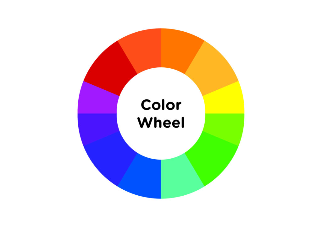
1 – The Color Wheel
The color wheel is a vital tool for selecting color schemes. It displays primary, secondary, and tertiary colors alongside their associated hues, tints, tones, and shades. Mixing white, black, and gray with the original colors creates brighter, lighter, softer, and darker colors. This allows you to experiment and create unique color schemes for your projects.
Definitions and Terms
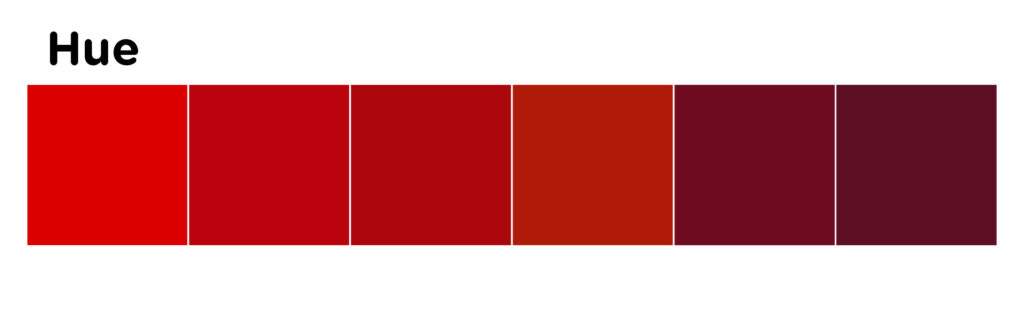
Hue
The term ‘hue’ refers to the quality of color that distinguishes it from other colors. It is essentially what color you are specifying. Hue also refers to the dominant wavelength of color out of the 12 basic colors. For instance, the hue of crimson is red.
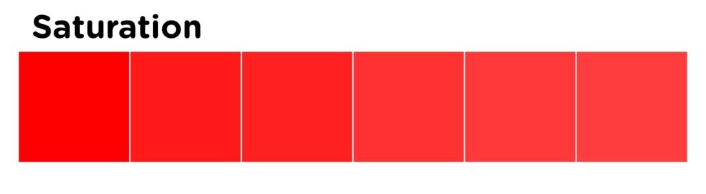
Saturation
Saturation refers to the intensity of color, or how pure a color is. A high saturation indicates a very bright color, while desaturation refers to a washed out or grayed out color.
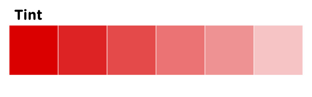
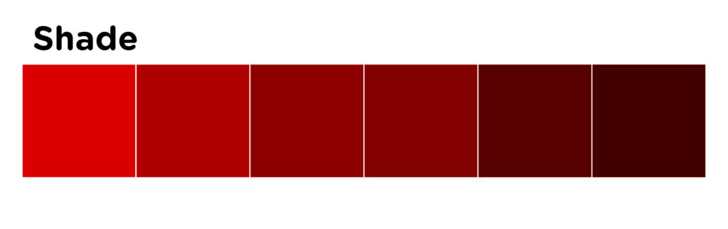
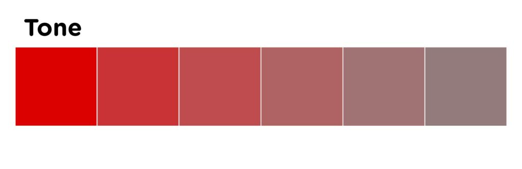
Varieties of Color
Tints are colors created by adding white to a hue.
Shades are colors created by adding black to a hue.
Tones are colors created by adding grey to a hue.
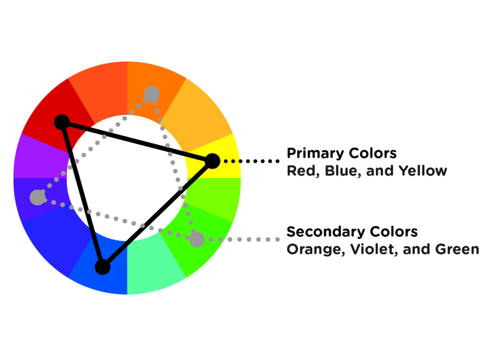
Primary Colors
Red, blue, and yellow are considered “primary” colors because they cannot be created by combining other colors. They are the most fundamental and basic colors. Because they are the foundation of every color, they can be mixed to create a vast range of colors.
Secondary Colors
Secondary colors are created by mixing two primary colors and are located between them.
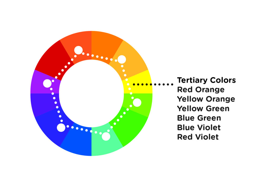
Tertiary Colors
These colors are a blend of two secondary colors and are positioned between them in the color wheel.
2. Colors in Context
Color Harmony
Understanding color theory can be achieved by first comprehending the significance of color placement on the color wheel and how it affects color harmony. Warm colors, such as red, orange, and yellow, are associated with heat, fire, the sun, and blood. They are energizing in nature and create a feeling of excitement, movement, or passion. On the other hand, cool colors, such as blue, green, and purple, are associated with cold, night, stillness, despair, and sadness. They evoke feelings of peace or serenity and can be calming. It is important to note that the use of warm and cool colors can greatly impact your visual product.
Color Schemes
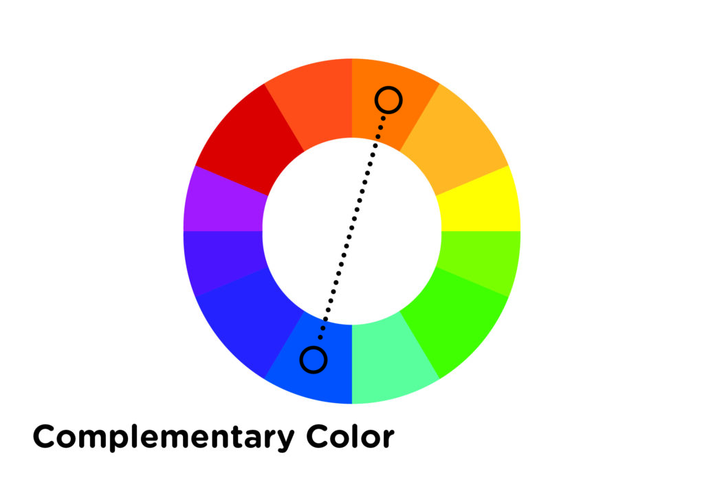
1. Complementary Colors
Opposite colors on the color wheel are known as complementary colors. Because they are far away from each other, they create a dissonant relationship. When placed side-by-side, complementary colors can produce a lot of contrast, but we need to be cautious because it can be overwhelming to the viewer if used excessively. Additionally, complementary colors can easily compete with each other and create visual chaos. Therefore, it’s best to use one color as a dominant shade and the other as an accent color.
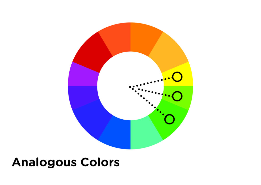
2. Analogous Colors
On the color wheel, a combination of two to four colors that sit adjacent to each other is known as an analogous color scheme. These colors have a harmonious relationship due to their close proximity. Even though they are considered to be a calm and relaxed combination, it is still recommended to choose one color as the dominant and use the others as accents.
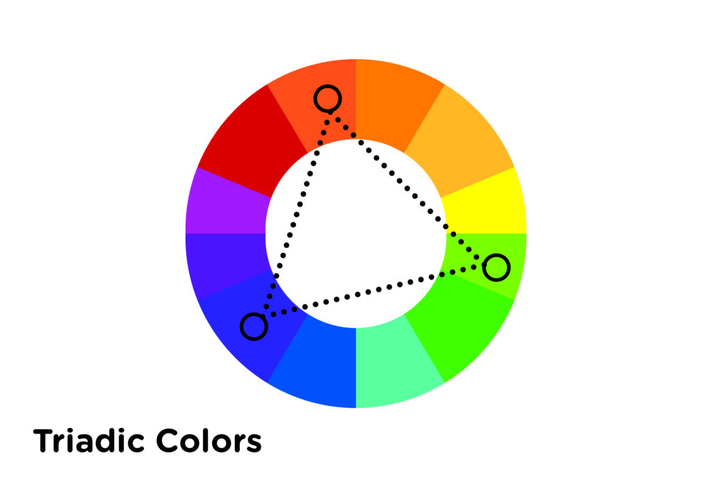
3. Triadic Color scheme
To follow the triadic color scheme, one needs to pick three colors that are equally spaced on the color wheel. Despite their even distance, the colors may not always create a harmonious effect if not used properly. Therefore, it is still recommended to use one color as the dominant and the other two colors as accents. This will help to create a visually appealing and balanced color scheme.
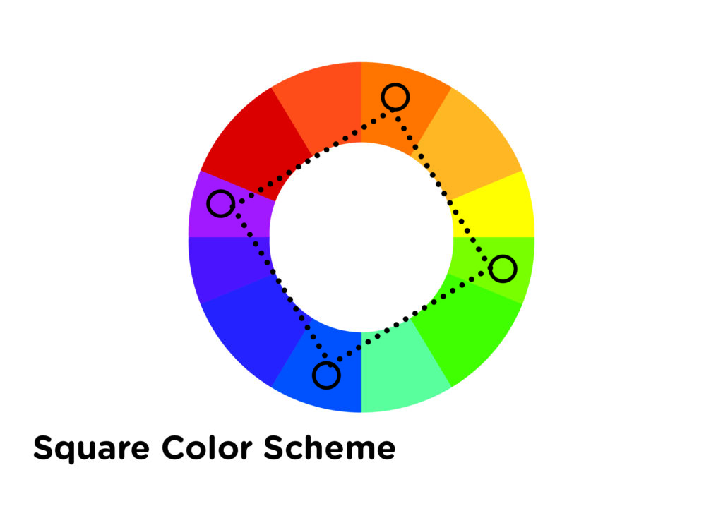
4. Square Color Scheme
For this color scheme, we’ve used four colors that are equally spaced around the color wheel, similar to the previous one. However, it’s important to note that the proximity of the colors can create patterns, but the use of more than one can cause dissonance. Therefore, we recommend you handle the colors with care and stick to the one dominant color rule.
5. Tetradic (rectangle) Scheme
When it comes to utilizing colors in a painting, there are various methods that a painter can follow. One such method is the use of four hues, just like a square, where the colors are arranged in a manner that creates two complementary colors. While this method may be tricky to implement, it offers a lot of variety to the painter. However, it is recommended to follow the one dominant color rule, which guarantees the best results. Additionally, when using the tetradic color scheme, one should always consider the color temperature.
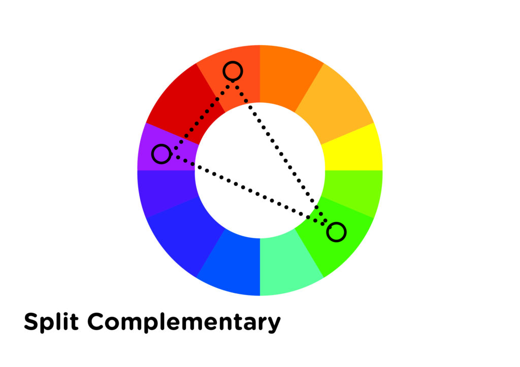
6. Split Complementary Colors
When using a three-color scheme, it is recommended to have one base color and two additional colors that are adjacent to the base’s complementary color. However, it is important to be careful with the proximity of these colors to avoid unwanted dissonance. Therefore, it is recommended to follow the one dominant rule.
7. The Monochromatic Color Scheme
This scheme is based on one color and its variations, achieved by adjusting saturation and brightness through addition of white, black, or gray.
Color Temperature
Color temperature, in the context of color theory, refers to the warmth or coolness of a color. Warm colors, such as red, yellow, and orange, are generally bold and vivid. They tend to appear closer to the viewer, while cool colors, such as green, blue, purple, white, and gray, are considered calm and soothing in nature. Cool colors tend to recede in space and create a sense of depth. For example, distant mountains might appear a cooler blue or purple, while objects in the foreground might have warmer notes. Artists can use warm and cool colors to create realistic and exciting works by understanding the temperature of a color in the subject and using it accordingly in their paintings.
Warm Colors
Warm colors, in the realm of art, are those hues that impart a sense of warmth, such as red, orange, and yellow. These colors are often associated with fire, the sun, and heat. They can create an atmosphere of intimacy and excitement and make an area feel closer.
Colors: Red, orange, red orange, yellow, yellow-green, and red-violet.
Mood: Excitement, liveliness, joy, anger, love or passion.
Association: Summer, fall, fire, anger, and blood.
Property: They have a tendency to be more dynamic and colorful, thus attracting the attention of the viewer.
Cool Colors
In art, cold colors refer to hues that create a sense of coolness. These colors include blue, green, and pale purple. They are often associated with water, grass, and sky. The use of these colors can create a sense of distance and make an area appear further away. They are also capable of making a space feel more serene and calming, although they might also be associated with sadness and depression.
Colours: Blue, green, blue-green, violet, and blue-violet.
Mood: calm, serenity, sadness, stillness, death, and shadow, .
Association: Water, Ice, Sky, and Winter
Property: They create a calming effect on the viewer due to their receding and relaxing nature.
How to use warm and cool colors in art and design
Now that we know all about warm and cool colors let’s look at how to use them in our artwork.
Use warm colors to attract attention – The most important part of a piece is the focal point, where you want the viewer’s eye to be drawn. Warm colors can be used to attract attention to this area.
Use cool colors to create a sense of space – If you want to create the illusion of depth or distance, use cool colors as they tend to recede, while warm colors come forward.
Use warm and cool colors to create contrast – This will add visual interest. Warm colors create contrast in cool palettes.
Be careful to consider the relative color temperature. – The colors around a particular color can affect the way it looks. So, when choosing a warm tone, you don’t necessarily have to stick to reds, oranges, and yellows. Even a blue with a slight tint of violet can be the warmest color in your painting, while still having all the warm tone properties.
Application
Reflection
Find one well-known Painting or Take a look at the brand logos of well-known brands. Try to identify the colors used by the designer or artist.
Here are a few guiding questions to help you reflect on your observations:
– What colors did the artist or designer use?
– Can you identify the color scheme used by the designer or artist?
– Based on the lesson about color psychology, why do you think they used that particular color combination?
– What emotions or reactions do you think the artist or designer is trying to evoke?
To Do this week – Scaffolding
Watch This youtube video to see how canva can be a tool to help you create color schemes:
How have you found the balance of passive and active learning in this course for your learning? How does it compare to your experience in other courses?
I found that this course struck the perfect balance between passive and active learning approaches. All of the readings were relevant, and thought-provoking and provided enough support for me to complete the activities required to engage in the active learning part of the course. The activities assigned varied per module, giving me a plethora of tools and options to design lessons and activities. To be honest, I found the course a bit overwhelming at first, given the amount of work required compared to my other subjects, which only require a written and creative output. However, I know that this course will be extremely useful for my capstone project next term, which is a Playbook for Art Educators. This project will provide practical ways to include design in Art Education via a website. Thanks to this course, I now have an arsenal of tools that will enable me to build this website with ease.
What was your experience of trying out H5P? Which of the activities do you think you would make most use of in your teaching context and what would you use them to do? Which ones do you think require the most resources to create?
I had a great experience using H5P to create my interactive learning activity. It’s an enjoyable and practical tool for students to reinforce their learning. As for Design training, I believe that the following activities would be the most beneficial:
Image Choice – This can be used for a lesson about selecting appropriate images for Display ads and other design output.
Find multiple Hotspots – I envision this as a way to train designers to identify which design element works and which does not work for a design material. This can also be used to check grammatical errors or spotting errors based on the design brief.
Image pairing – This learning activity will be best in selecting colours, design elements as well and images. The designer or student can be asked to select appropriate colours that are applicable for certain businesses like restaurants, real estate and medical.
Can you describe (step by step) an example of scaffolding in a learning experience that you’ve designed or experienced?
Scaffolding in a learning experience is a concept that is new to me. However, as I recall how I have built some of the curricula I have designed before, particularly for graphic designers, I believe I have in essence applied the steps described in the 6 Specific Instructional Scaffolding Strategies:
1. Model – The curriculum I have designed for graphic designers before is divided into 2 phases – we call the first phase, Classroom Training where trainers will demonstrate step by step how to design a display ad, based on a creative brief, using a design software. An activity that will allow students to demonstrate what they have learned through the demonstration will follow this, and that is our second phase, which we have called, Assisted Training, wherein the trainer will assist the student as they complete the task.
2. Use Prior Knowledge – Most of the students that we teach are graduates of design. We rely on the prior knowledge they have acquired when they were in design school. Our design lessons are a review of the design fundamentals they have learned as a student but the application is real-life work scenarios, such as designing a display ad or an animated ad.
3. Talk About It – In our design courses, we provide feedback to students on how they can further improve their layout, colour choices and typography. This can be achieved through discussion by showing before and after versions of a design, with the assigned trainer (one one-on-one) or through group discussion.
4. Share Important Vocabulary – Process training is also important aside from Creative lessons. Relevant terminologies that will be useful for students are provided through process manuals or account specification manuals.
5. Show What You Mean – Demonstration plays a huge part in our courses, You cannot teach Image manipulation without demonstrating how to do it using a design software, in our case, Adobe Photoshop. Demonstrations are always followed by a hands-on activity for knowledge check and retention.
6. Use Technology – We support discussions and demonstrations with hands-on training that uses the actual software that they will use once they start their job. We also make use of video tutorials and learning management systems to support our facilitator-led classes.
References
Why is colour theory important? A guide to powerful graphic design. 2023
Tanner, 2023, Lesson 2 – A Quick Lesson in Color Theory
Cherry, 2022, Color Psychology: Does It Affect How You Feel? How Colors Impact Moods, Feelings, and Behaviors
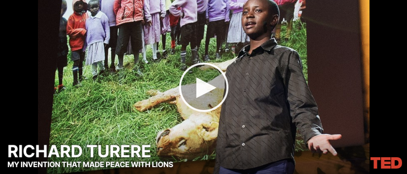
I find the presentation of Richard Turere, the 12-year-old Masai Boy from Kenya, very compelling. I was hooked the moment the images from the Nairobi park came to the screen, mainly because of my interest in nature and wildlife and also the immersive quality of how these images are used to support Richard’s story. It made the viewers feel as if they were part of the story too. It also helped a lot that Richard even at such a young age is engaging as a speaker. This presentation for me pretty much used a lot of the storytelling techniques from the story being a personal story of the presenter, the way he hooked the audience with larger-than-life images of his home, the tension he described between keeping their cattle safe from the lions in the reserve and the way how he resolved that conflict ultimately a win-win situation for both his tribe and the lions.
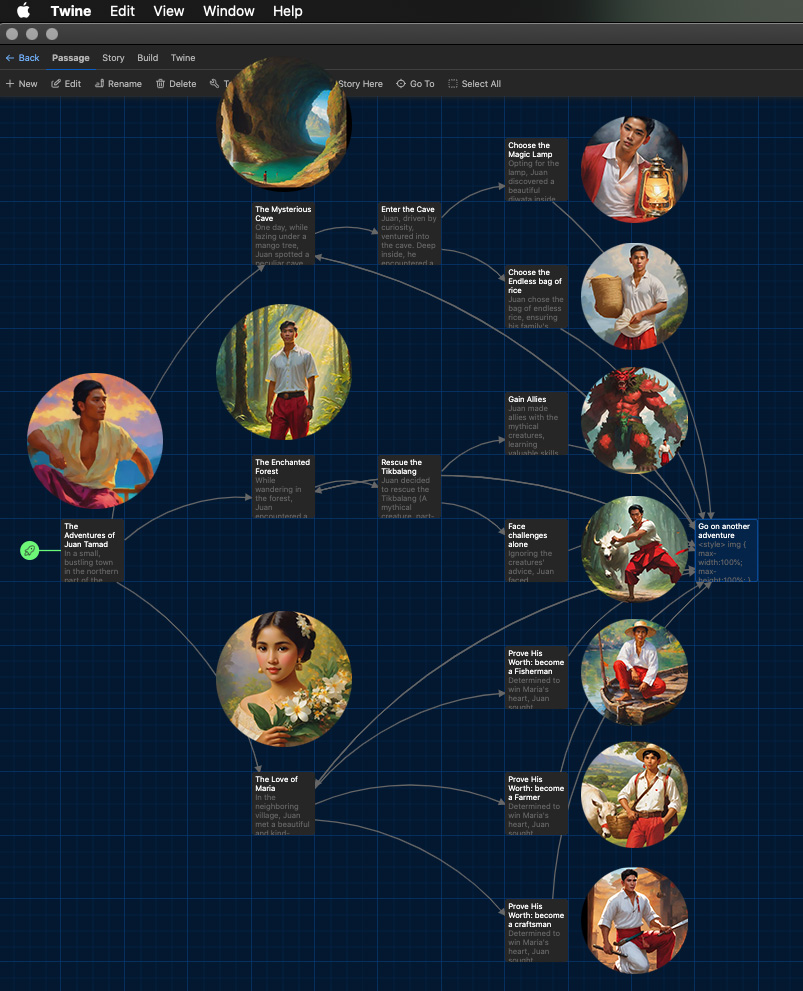
My Twine Story
The Adventures of Juan Tamad (Lazy John)
The story I made for my twine is based on a folklore from the Philippines about a character named Juan Tamad (Lazy John). His story has many variations but is full of misadventures. I made a version wherein he learned important life lessons and proved that even the laziest of souls could find courage, wisdom, and love in the face of challenges. Above is the screenshot of my twine story, I added AI-generated images to illustrate the characters and the setting. An option to go on another adventure is given after each story.
The Adventures of Juan Tamad
In a small, bustling town in the northern part of the Ilocos region in the heart of the Philippines, there lived a young man named Juan Tamad (Tamad – meaning lazy). Juan was known far and wide for his laziness, often avoiding work. Despite his lack of ambition, fate had a peculiar way of throwing him into extraordinary situations, each requiring a choice that would shape his destiny.
Three options for adventures
Adventure 1 – The Mysterious Cave
One day, while lazing under a mango tree, Juan spotted a peculiar cave hidden amidst the hills of Mount Sicapoo. Intrigued, he decided to investigate.
Option 1 – Enter the Cave
Juan, driven by curiosity, ventured into the cave. Deep inside, he encountered a mystical creature, the Duwende (a dwarf), who offered him a choice: a bag of endless rice or a magical lamp with a wish-granting Diwata (good fairy) inside.
Option 1.1 – Choose the Endless bag of riceJuan chose the bag of endless rice, ensuring his family’s prosperity. However, he soon faced challenges on how to use this newfound wealth wisely.
Option 1.2 – Choose the Magic Lamp
Opting for the lamp, Juan discovered a beautiful diwata inside. He could use his wishes to help others, enrich his community, or fulfill his own desires.
Option 2 – Go on another adventure
Adventure 2 – The Enchanted Forest
While wandering in the forest, Juan encountered a group of talking animals. They were in great distress because their leader, a wise Tikbalang (A mythical creature, part-man, part-horse), was captured by a wicked engkanto (a fairy or a sprite).
Option 1 – Rescue the Tikbalang
Juan decided to rescue the Tikbalang (A mythical creature, part-man, part-horse) and embarked on a quest deep into the enchanted forest. Along the way, he met mythical creatures like Kapre (huge and hairy creature who smokes tobacco and stays on top of a tree) and Nuno sa Punso (old man of the mound), who either aided or hindered his progress.
Option 1.1 – Gain Allies
Juan made allies with the mythical creatures, learning valuable skills and insights about the forest’s magic. With their help, he rescued the Tikbalang and earned the forest’s gratitude.
Option 1.2 – Face challenges alone
Ignoring the creatures’ advice, Juan faced challenges alone, relying solely on his wit and resourcefulness. His journey was tougher, but in the end, he managed to rescue the Tikbalang and gained their respect.
Option 2 – Go on another adventure
Adventure 3 – The Love of Maria
In the neighboring village, Juan met a beautiful and kind-hearted girl named Maria. He was instantly smitten, but she demanded proof of his worth before considering his affections.
Option 1.1 – Prove His Worth: become a Fisherman
Determined to win Maria’s heart, Juan sought employment, despite his lazy nature. He could choose to work as a fisherman, a farmer, or a craftsman, each job teaching him important life lessons.
Juan became a skilled fisherman, learning the importance of patience and perseverance. His hard work earned him the respect of the village and, eventually, Maria’s love.
Option 1.2 – Prove His Worth: become a Farmer
Determined to win Maria’s heart, Juan sought employment, despite his lazy nature. He could choose to work as a fisherman, a farmer, or a craftsman, each job teaching him important life lessons.
Working as a farmer, Juan understood the value of nurturing and patience. His dedication resulted in a bountiful harvest, impressing Maria and her family.
Option 1.3 – Prove His Worth: become a craftsman
Determined to win Maria’s heart, Juan sought employment, despite his lazy nature. He could choose to work as a fisherman, a farmer, or a craftsman, each job teaching him important life lessons.
Mastering the art of craftsmanship, Juan showcased his creativity and dedication. His intricate creations captured Maria’s heart, leading to their happily ever after.
Option 2 – Go on another adventure
I can see Twine as a great learning tool for gamification of your learning content. If I envision this for use in a design lesson, I can employ the use of Twine to present scenarios to students to select the appropriate font or color for a design project, such as a display ad. As they select options you can insert explanations on why or how their selected option is a good choice or otherwise.
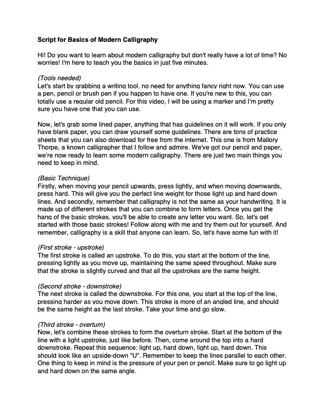
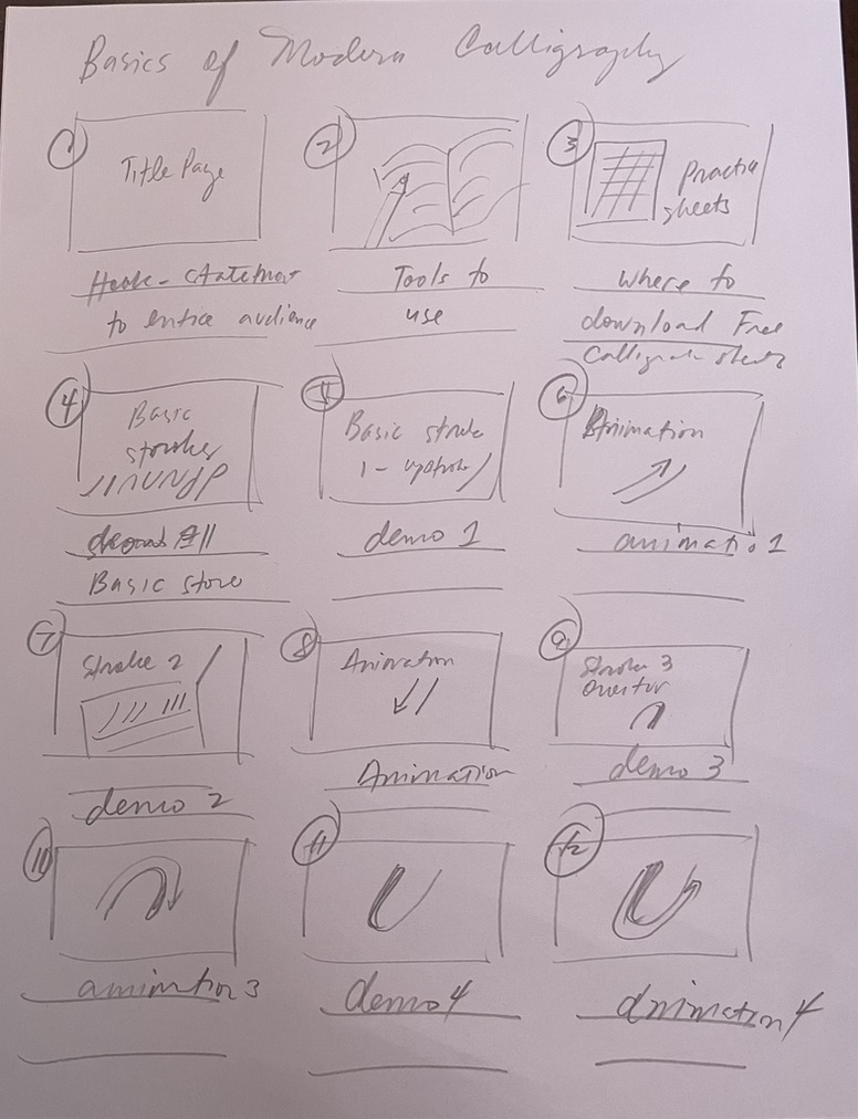
Video for a Learning Purpose – Basics of Modern Calligraphy
What is the learning purpose of your video?
I find the art of calligraphy both modern and traditional, fascinating. It’s also something I do to destress and veer away from my usual digital work. In this learning video, Basics of Modern Calligraphy, I aim to teach the basic strokes that one needs to learn to write modern calligraphy. You can combine these different strokes to form letters and as you continue to practice, you’ll be able to create any letter you want. I also want to convey that calligraphy is not the same as one’s handwriting, and even if you don’t have the best handwriting, you can still learn and practice calligraphy.
Which of the principles we’ve covered this term (e.g., Mayer/Universal Design for Learning/Cognitive Load Theory) did you incorporate into your design and why?
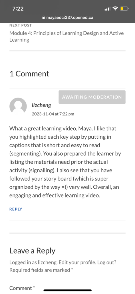
In this learning video, I incorporated Mayer’s Segmenting, Coherence, Signaling, Spatial and Temporal contiguity Principles. Following the segmenting principle, I made sure that the video is not too long and dragging. I chose YouTube as the platform so the viewer will have the option to pause and rewind. I demonstrated how each of the basic strokes is performed one at a time and provided two camera angles so the viewer will have a clear view of how they will write each calligraphy stroke. I also inserted a frame-by-frame animation on how each of the basic strokes are written, with arrows to guide the learner on where to start and the direction of the handwriting, this visual element is also an application of Mayer’s Signaling, Spatial and Temporal contiguity principle.
I also believe that this provides a bit of a pause between each calligraphy stroke before the next demonstration. Using the coherence principle, and to avoid extraneous load, I did not insert any background music anymore so the viewer could focus on the instructions I was providing during the demo. I am aware that I tend to talk fast, and with English as my second language, I am aware of my challenges with pronunciation and diction.
I used related images of written calligraphy (credits to my husband who is also into calligraphy and admittedly a better calligrapher than me =)) so viewers will have an idea of what they can achieve if they practice. I focused on the basic strokes in this learning video to avoid overload of information and can focus on practising those basic strokes first (Germane cognitive load). Lastly, is the application of Mayer’s Signalling principle, where the frame-by-frame animation on how each of the basic strokes is performed, I also presented towards the end how these basic strokes when used and combined can result in a specific letter.
What was challenging about capturing your own video?
What was challenging was synching the voice-over with the video. It is difficult to demonstrate how each of the strokes is done while talking, and it will be hard for me to follow the written script if I do that. So It took a lot of adjustments and practice, on both the video duration and the speed of how I read the script before I was able to synch both elements together.
I also find it hard to do voice-over and applying the personalization principle as I feel self-conscious about the way I speak, even with a lot of practice. Having a script to read helped a lot but maintaining an enthusiastic tone throughout is a bit of a challenge for me.
What did you find easiest?
Because calligraphy is a topic of interest for me, it was not hard for me to come up with the script, do the demo, and find relevant materials to complete this learning video. I have also had experience making videos using iMovie and Quicktime for work and in some of my subjects before so shooting this video is not that difficult anymore.
How would you approach capturing video differently next time?
With the challenge of timing and synching the video with the voice-over, I will be making sure to follow how I have planned the learning video by sticking with the storyboard. The first part of my video transitioned to the actual demo right away so I had to cut some parts of the introduction in the script and insert images into the video to be able to transition well into the first demonstration of the basic strokes.
Script and storyboard for my learning video
Sulat – A simple story about the value of teaching and learning
In line with the lesson about Storytelling and creating a learning video, I’d like to share a video that I made from one my subjects last summer. Titled “Sulat”, a Filipino word which has two meanings – a letter or a message and write or handwriting. The story starts with a mother teaching her child how to write his name, writing the child’s name first and guiding the child’s hand to trace his name. The writing skills of the child progressed from just writing his nickname to his full name and eventually writing in script.
The video started slowly then faster to present the passage of time. In between the lessons in writing are fun moments spent together drawing, doodling and coloring. There is less visibility of the mother’s hand in the video as the child becomes more self-reliant, the only subtle proof that the mother is there are the snacks given to the child as he studies on his own.
The last part of the story presents the child, now a man, writing a letter to his mother, the handwriting, now a flawless script, alludes that hardwork and practice always pays off and behind every beautiful artwork, handwriting, and story are the efforts of the people who helped and supported the student to eventually reach that level of expertise. It also highlights the role of parents, teachers and mentors in the learning process of a child or a student.
I chose to depict the scenes from a top view perspective to ensure that the focus is on the action of writing, with only the elements on the table changing and the hand progressing from a child, an older child and eventually a man.
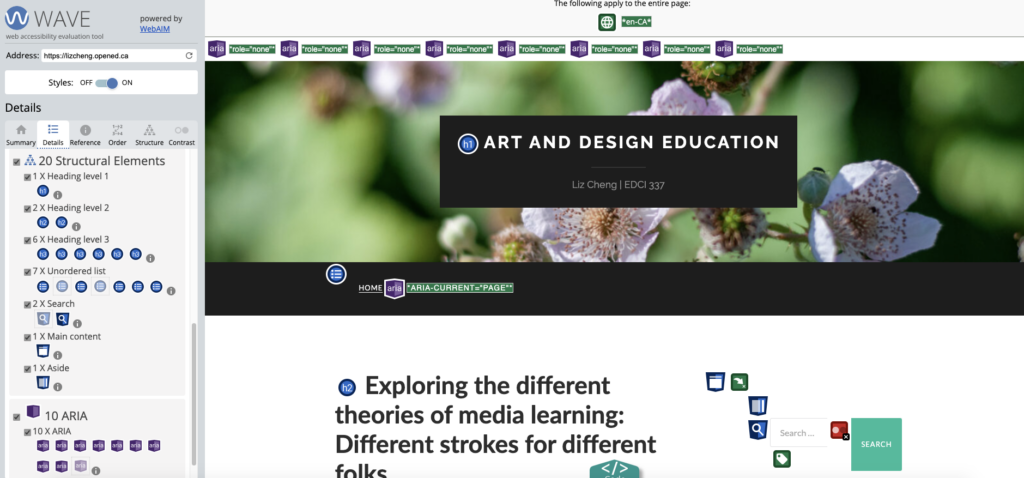
When I first started creating my blog, I had limited experience with web design and was uncertain of how to make my content accessible to all users. However, using the WAVE accessibility report, provided me with a detailed analysis of my website’s accessibility, including information on structural elements, contrast, and figcaptions. By using this tool, I was able to identify areas of my website that needed improvement and make the necessary adjustments to ensure that my content was accessible to all users.
As I continue to create blog posts, I plan to use the WAVE accessibility report to ensure that my content is accessible to everyone and that I can create a website that is user-friendly and easy to navigate.
What does inclusive design mean to you?
Inclusive design is when designers consider people from different backgrounds and abilities while creating products or services. It involves finding solutions for people with disabilities, such as visual impairment, to access services they may not have been able to before. This could be anything from map navigation to opportunities for learning, or even just being able to read a text message on their phone.
As someone who speaks English as a second language, I sometimes struggle to understand people due to accents and speaking speed. Having subtitles in a video or neutral accents in presentations is a great help for me. When designing a presentation, including the option for a voiceover to read my script can help reduce my anxiety and fear of doing presentations on my own. This makes it easier for me to create my presentations confidently.
A simple animation illustrates our interconnectedness and how inclusivity efforts impact society. At the end of the animation is just white, representing peace.
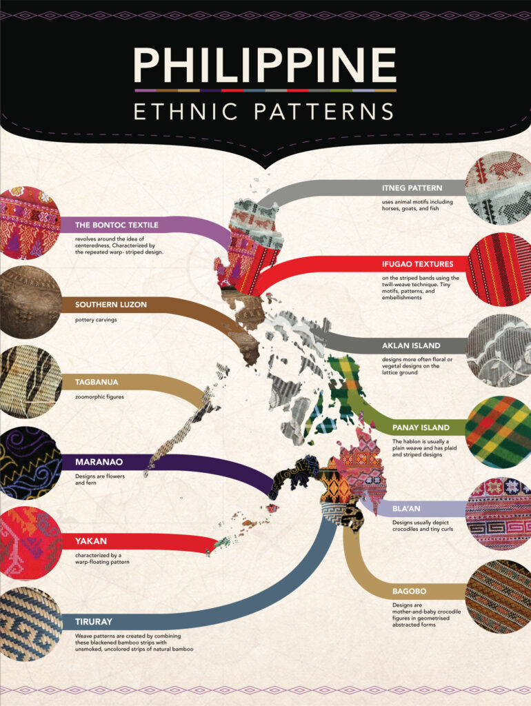
My infographic – The Philippine Ethnic Map
This infographic is based on an artistic prompt I did for one of my subjects last year, which focused on exploring the significance of places to individuals, the distinctive features of these places, and how mapping them can help us better understand and appreciate them.
The map I created showcases the vibrant and intricate art and patterns of various ethnic groups across the different regions of my home country, the Philippines. It is not a map to organize but to display, understand and locate art and its origin.
In creating this infographic, I organized the information by labelling each pattern according to the tribe’s location in the map. This helps to provide a quick reference point for the viewer and aids in understanding the geographic distribution of each tribal pattern.
To enhance the visual impact of the infographic, I opted for a simple white background. This allows the intricate details of each pattern to stand out and be appreciated. Additionally, I made sure that each tribal pattern was large enough to be viewed easily and clearly. By doing this, I aimed to ensure that the viewer could fully appreciate the beauty and complexity of each of the tribal patterns.
I used repetition to connect each pattern to its location on the map. This helps to reinforce the geographic distribution of each tribal pattern and makes it easier for the viewer to understand the context in which they exist.
To guide the viewer’s eye, I employed design element such as bars and shapes. These elements are used to create a clear visual hierarchy and highlight the key information presented in the infographic.
To ensure that the text did not detract from the patterns, I used a simple font for the title. This helps to avoid distractions from the colorful patterns and ensures that the text is easily readable while complementing the overall design. Although I used reverse fonts to label the pattern names, I ensured they are big enough to be read.
Everyone has their unique style of learning. It’s important for educators to recognize this when developing lesson plans to ensure that their students achieve the intended learning outcomes. After exploring the different principles of Cognitive Theory of Multimedia Learning, I found that Allan Paivio’s Dual-Coding Theory resonated with me the most. As someone who has developed training modules for designers, I believe it’s crucial to focus on stimuli and create connections between different aspects of the lesson, such as through hands-on exercises, to help learners gain knowledge.
In my tutorial on Basic Adobe Indesign, I presented the lesson in a clear and concise manner. I provided learners with an image of the software’s interface and tools to give them a better understanding of the program. Additionally, I demonstrated how to use several of the fundamental tools to help them get started.
Hi everyone! My name is Liz Cheng and I am in my second year in M.Ed Art Education. I am a graphic designer and a design educator from the Philippines now living in Victoria BC, Canada. I joined the M. Ed. Art Education program to further develop my skills as an educator and to allow my artist self to re-emerge. I strongly believe that expanding our knowledge should be a continuous process, even if it entails exploring new territories beyond our accustomed environment. I take inspiration from my family who have supported me in my creative and professional pursuits.
A photograph I took of one of the Totem Poles at Thunderbird Park, Victoria, BC.
As a new settler in this unceded territory, I acknowledge and respect the beautiful and traditional territories of the lək̓ʷəŋən peoples, and the Songhees, Esquimalt, and W̱SÁNEĆ First Nations. As I explore and build connections, I find joy and a sense of belonging in this new place.


Recent Comments