Comment for https://kayleymcn.opened.ca/
Comment for https://natsblog.opened.ca
Liz Cheng | EDCI 337
When I first started creating my blog, I had limited experience with web design and was uncertain of how to make my content accessible to all users. However, using the WAVE accessibility report, provided me with a detailed analysis of my website’s accessibility, including information on structural elements, contrast, and figcaptions. By using this tool, I was able to identify areas of my website that needed improvement and make the necessary adjustments to ensure that my content was accessible to all users.
As I continue to create blog posts, I plan to use the WAVE accessibility report to ensure that my content is accessible to everyone and that I can create a website that is user-friendly and easy to navigate.
Inclusive design is when designers consider people from different backgrounds and abilities while creating products or services. It involves finding solutions for people with disabilities, such as visual impairment, to access services they may not have been able to before. This could be anything from map navigation to opportunities for learning, or even just being able to read a text message on their phone.
As someone who speaks English as a second language, I sometimes struggle to understand people due to accents and speaking speed. Having subtitles in a video or neutral accents in presentations is a great help for me. When designing a presentation, including the option for a voiceover to read my script can help reduce my anxiety and fear of doing presentations on my own. This makes it easier for me to create my presentations confidently.

A simple animation illustrates our interconnectedness and how inclusivity efforts impact society. At the end of the animation is just white, representing peace.
This infographic is based on an artistic prompt I did for one of my subjects last year, which focused on exploring the significance of places to individuals, the distinctive features of these places, and how mapping them can help us better understand and appreciate them.
The map I created showcases the vibrant and intricate art and patterns of various ethnic groups across the different regions of my home country, the Philippines. It is not a map to organize but to display, understand and locate art and its origin.
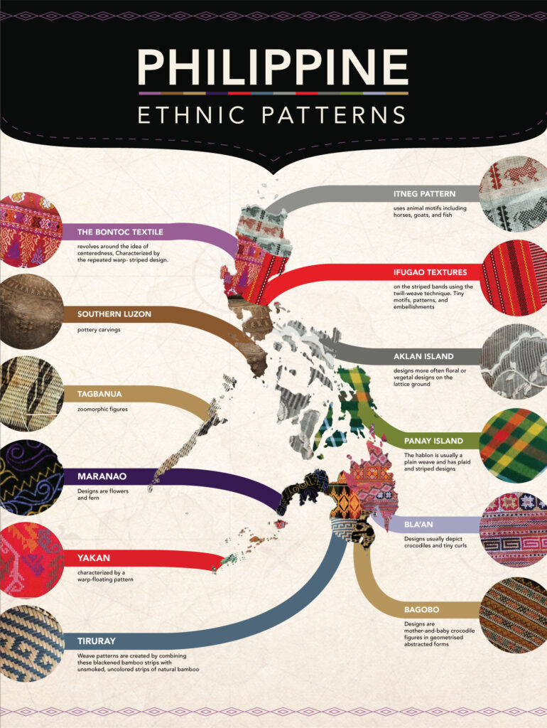
In creating this infographic, I organized the information by labelling each pattern according to the tribe’s location in the map. This helps to provide a quick reference point for the viewer and aids in understanding the geographic distribution of each tribal pattern.
To enhance the visual impact of the infographic, I opted for a simple white background. This allows the intricate details of each pattern to stand out and be appreciated. Additionally, I made sure that each tribal pattern was large enough to be viewed easily and clearly. By doing this, I aimed to ensure that the viewer could fully appreciate the beauty and complexity of each of the tribal patterns.
I used repetition to connect each pattern to its location on the map. This helps to reinforce the geographic distribution of each tribal pattern and makes it easier for the viewer to understand the context in which they exist.
To guide the viewer’s eye, I employed design element such as bars and shapes. These elements are used to create a clear visual hierarchy and highlight the key information presented in the infographic.
To ensure that the text did not detract from the patterns, I used a simple font for the title. This helps to avoid distractions from the colorful patterns and ensures that the text is easily readable while complementing the overall design. Although I used reverse fonts to label the pattern names, I ensured they are big enough to be read.
Everyone has their unique style of learning. It’s important for educators to recognize this when developing lesson plans to ensure that their students achieve the intended learning outcomes. After exploring the different principles of Cognitive Theory of Multimedia Learning, I found that Allan Paivio’s Dual-Coding Theory resonated with me the most. As someone who has developed training modules for designers, I believe it’s crucial to focus on stimuli and create connections between different aspects of the lesson, such as through hands-on exercises, to help learners gain knowledge.

In my tutorial on Basic Adobe Indesign, I presented the lesson in a clear and concise manner. I provided learners with an image of the software’s interface and tools to give them a better understanding of the program. Additionally, I demonstrated how to use several of the fundamental tools to help them get started.
Hi everyone! My name is Liz Cheng and I am in my second year in M.Ed Art Education. I am a graphic designer and a design educator from the Philippines now living in Victoria BC, Canada. I joined the M. Ed. Art Education program to further develop my skills as an educator and to allow my artist self to re-emerge. I strongly believe that expanding our knowledge should be a continuous process, even if it entails exploring new territories beyond our accustomed environment. I take inspiration from my family who have supported me in my creative and professional pursuits.

A photograph I took of one of the Totem Poles at Thunderbird Park, Victoria, BC.
As a new settler in this unceded territory, I acknowledge and respect the beautiful and traditional territories of the lək̓ʷəŋən peoples, and the Songhees, Esquimalt, and W̱SÁNEĆ First Nations. As I explore and build connections, I find joy and a sense of belonging in this new place.
© 2025 Art and Design Education
Theme by Anders Noren — Up ↑
Recent Comments